FreshBooks introduces a bold new brand identity
The brand’s first major update in 15 years is being supported by a new campaign from OstrichCo
Accounting software company FreshBooks has unveiled a fresh new look that represents its commitment to standing beside its small business customers as they embark on their growth journey.
The brand identity work from Atlanta design agency Son & Sons marks the first major update to the company’s brand image in 15 years. It was developed with extensive consultation with FreshBooks customers about what it takes to start, manage and grow their own businesses.
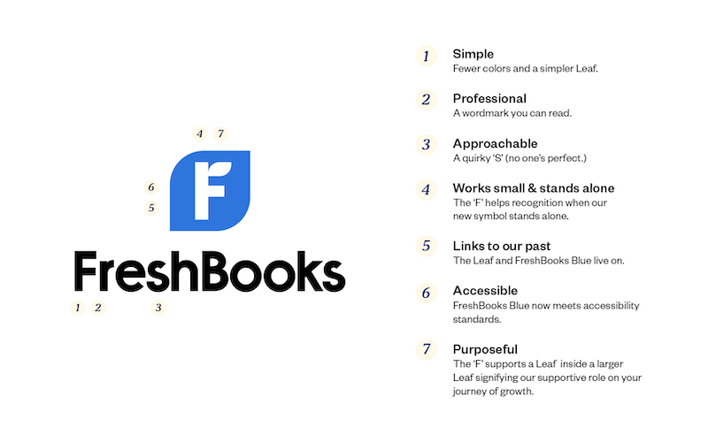
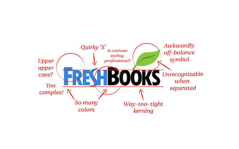
The new brand was designed with simplicity, professionalism, and approachability in mind, while retaining elements like the FreshBooks Lead and FreshBooks Blue color that have been part of its identity since the beginning. The elements have been updated to reflect an increasingly visual world in which iconography is more important than ever.
The new brand identity is built around a stylized “F,” chosen from literally hundreds of candidates, that sits inside a leaf shape. The “F” has been uncoupled from the FreshBooks name, allowing for greater brand recognition even when the logo stands on its own.
The FreshBooks nameplate, meanwhile, has retained lovable quirks like an “S” that doesn’t quite match up with the rest of the letters, a deliberate effort to demonstrate approachability by showing that nobody is perfect.
“We talked with all types of small business owners about what it really takes to start, manage and grow a business of their own,” says Wade Thompson, founder, president and creative director of Son & Sons. “These gritty conversations helped us build a genuine brand with FreshBooks that addresses the real needs of so many business owners.”
“We live to work for great brands and FreshBooks is unwavering in its dedication to small business owners.” He added. “It’s refreshing to remember that business is personal.”
The rebrand was tested in Texas prior to being rolled out across other FreshBooks markets. It was further supported by the company’s first major integrated brand campaign, developed by Toronto/NYC agency, OstrichCo called “Not Alone.”
“Truth be told, the campaign was conceived and produced, pre-pandemic,” says Patrick Scissons, OstrichCo Founder & CEO/CCO. “But the insight of the small business owner feeling isolated and alone has never been more relevant.”
The brand campaign is currently running across YouTube, Facebook and programmatic channels in Canada, the U.S. and the United Kingdom.
“A logo alone does not make a brand,” adds Paul Cowan, chief marketing officer at FreshBooks. “A brand is built around the experiences a company creates: How it treats its customers, suppliers, and partners and the people it hires. Your purpose is only as good as how well you live it.”
Credits
Rebrand – Brand Identity
Client: FreshBooks
Chief Marketing Officer: Paul Cowan
Director, Content & Brand: Jane Flanagan
Head of Experience: Jeremy Bailey
Associate Director, Marketing: Robb Eng
Art Direction: Guillermo Pons Garcia, Paul Youn
Copywriting Lead: Daniel Reiter
Agency: Son & Sons
Creative Director: Wade Thompson
Director of Strategy: Leonard Rau
Design Lead: Michael DiCristina
Creative Content: Cameron Ohls
Rebrand – Brand Campaign “Not Alone”
Client: FreshBooks
Chief Marketing Officer: Paul Cowan
Director, Content & Brand: Jane Flanagan
Head of Experience: Jeremy Bailey
Associate Director, Marketing: Robb Eng
Agency: OstrichCo
Production Company: Untitled Films
Director: Mark Gilbert
Director of Photography: Trent Opaloch
Editorial: Saints Editorial
Editor: Griff Henderson
Post: OstrichCo / EPS
Audio: Eggplant
Media: FreshBooks / Ostrich Media
Toronto Casting: Jigsaw
Vancouver Casting: Sean Milliken


Comments
Comments